Scatter chart widget
Path: Widget Gallery> Basic> Trends/Chart> Scatter Chart
A scatter chart is a type of diagram to display values for two variables from a set of data using Cartesian coordinates. The data is displayed as a collection of points, each having the value of one variable determining the position on the horizontal axis and the value of the other variable determining the position on the vertical axis. For this reason it is often called XY graph.
Parameters
| Main Parameter | Description |
|---|---|
| Axes Counter | Number of vertical (Y) axes. |
| Curves Counter | Number of curves to draw |
| Stripes Counter | The number of active strips. |
| Cursor | Properties related to cursor enabling and its graphic style |
| Style | Properties that allow you to customize the graphic style of the widget |
| Scatter Update Pause | Curves update frequencies expressed in milliseconds. |
| Auto Scaling | Properties to configure the automatic scaling feature. |
| Font | Properties of the characters used in the graphic |
| X Axis Y Axis 0 Y Axis 1 . . . |
Properties to configure the style of the axes |
|
Curve 0 |
Properties to configure the curves to be drawn |
| Stripe 0 Stripe 1 Stripe 2 . . . |
Properties to add and configure the stripes on the charts |
| Cursor Parameter | Description |
|---|---|
| Enable | Enable/Disable the visualization of the cursor |
| Label Enable | Enable the visualization of labels with the values of the curves intersected by the cursor |
| Position | Position of the cursor in the view. Can be between 0 and 1 (the default value is 0.5) |
| Color |
The colors of the cursor |
| Labels Color | The colors of the labels with the values of the curves intersected by the cursor. |
| Labels Width Labels Height |
Size of the labels with the value of the curves. The font size will be organized accordingly. |
| Style Parameter | Description |
|---|---|
| Horizontal Grid Lines |
Number of suggested horizontal grid lines. Chart widget tries to respect these number, but giving priority to the values shown on Y Axis which should be beautiful to read. This means integer values when it is possible or at worst with a single decimal digit. |
| Vertical Grid Lines | Number of suggested vertical grid lines. Chart widget tries to respect these number, but giving priority to the values shown on X Axis which should be beautiful to read. This means integer values when it is possible or at worst with a single decimal digit. |
| Background | Background color of the widget |
| Foreground | Color of the text where is not explicitly defined (e.g. the unit of measure shown inside axes controls) |
| Axes Control Background Color | Background color of the built-in axes control |
| Axes Control Shadow Color | Shadow color of the built-in axes control |
| Chart Background Color | Background color of the chart area |
| Toolbar Buttons Size | Width and Height of the built-in toolbar buttons |
| Grid Values Width | Width of vertical grids values (Y axes) |
| Grid Values Height | Height of horizontal grid values (X axis) |
| Width of the axes buttons | Width of the axes buttons |
| Axes Button Height | Maximum height of the axes buttons |
| Toolbar Color | Color used for toolbar icons and related items (like zoom rectangle) |
| Toolbar Enable | Show/Hide the built-in toolbar (on the top) |
| Axes Control Enable | Show/Hide the built-in axes control (on the left) |
| Auto Scaling Parameter | Description |
|---|---|
| Auto Scaling Enable | Enable or disable the auto-scale feature. Auto-scale ensures that the X axis maximum always take into account the most recent values of the curves. |
| Toolbar Button Visible | Show or hide the auto-scale button on built-in toolbar. |
| Font Parameter | Description |
|---|---|
| Font | Font of the chart's strings |
| Font Maximum Pixel Size | Maximum pixel size. The chart adapts the font size based on available space |
| Font Style | Font style |
| Font Bold | Set the font bold |
| Axis Parameter | Description |
|---|---|
| Minimum | Axis minimum value |
| Maximum | Axis maximum value |
| Color | Axis color |
| Unit of measure | It is a label associated with the axis/curve |
| Show Unit Of Measure On Axis | Show unit of measure in the built-in axes control |
| Show Unit Of Measure On Grid | Show unit of measure in the grid values |
| Show Unit Of Measure On Cursor | Show unit of measure in the cursor labels (not available for X axis) |
| Curve Parameter | Description |
|---|---|
| Scatter Curve Type |
Defines how the curve is updated :
|
| Scatter Tag X | X array tag to use for the X axis |
| Scatter Tag Y |
Y array tag to use for the Y axis. The Y array size must be smaller than (or equal to) the X array size |
| Axis | Select the axis associated with the curve |
| Custom Color Enable | Enable or disable the curve custom color selection. If disabled the color used for the curve is the same as the associated axis. |
| Style |
Curve style, can be:
|
| Line Width | Curve width in pixels. The maximum width is 5 pixels |
| Visible | Show/Hide the curve |
| Stripe Parameter | Description |
|---|---|
| Axis |
Associated axis:
|
| Custom Color Enable | Enable or disable the stripe custom color selection. If disabled the color used for the stripe is the same as the associated axis. |
| Start Value | Stripe start value |
| End Value | Stripe end value |
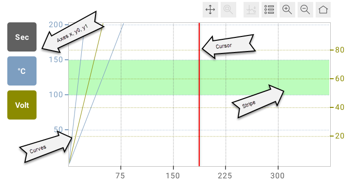
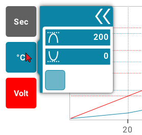
Built-in axes control
The Built-in axes control can be shown/hide from the "Axes Control Enable" property available inside the "Style Parameter" section.
The built-in axes control has a button for each defined axes. The first one on the top is related to X axis and the others with the defined Y axes.
Each button is managing the OnMouseClick and the OnMOuseHold events:
-
OnMouseClick
Is a toggle that show/hide the associate curve (only Y axes) -
OnMouseHold
If the button is held down for a couple of seconds, a small panel will be displayed where it will be possible to change the min/Max values of the axis.
Built-in toolbar
The Built-in toolbar can be shown/hide from the "Toolbar Enable" property available inside the "Style Parameter" section.
| Toolbar Element | Description |
|---|---|

|
Activate the moving of the graphic through gesture commands |
|
|
Activate the zoom mode through gesture commands |

|
Activate the moving of the cursor through gesture commands |
|
|
Opens the X axis control pane |

|
Zoom In the graphic |

|
Zoom Out the graphic |

|
Reset the graphic view |


ChartCommand action
The same commands available from the Built-in toolbar are available through the actions (see "ChartCommand")